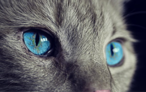
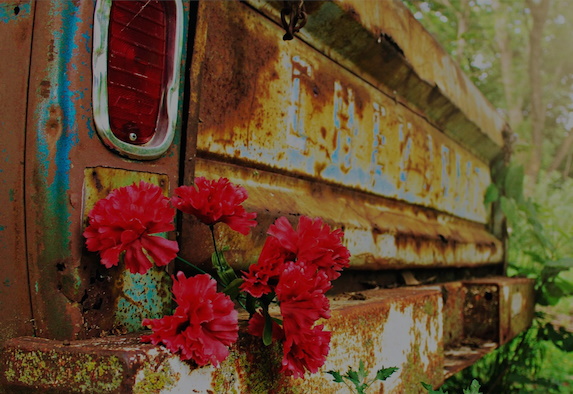
CSS Blend
CSS Blend Modes let us blend an element’s background layer with another layer. They allow blending between background images, gradients, and background colors.
CSS Blend Modes let us blend an element’s background layer with another layer. They allow blending between background images, gradients, and background colors.


overlay blending on text
HTML Tutorial
CSS Tutorial
JavaScript Tutorial
mix-blend-mode: normal | multiply | screen | overlay | darken | lighten | color-dodge | color-burn | difference | exclusion | hue | saturation | color | luminosity | initial | inherit;
gover1
gover2
gover3
gover6
conic-gradient
conic-gradient

normal: uses standard rules to break words
break-all: lines can be broken between any two letters
keep-all: break are prohibited between letters
Lorem ipsum dolor sit amet, consectetur adipiscing elit. Nam massa tellus, mollis sit amet sodales vitae, placerat dignissim mi. Pellentesque interdum lacus eget diam maximus consequat quis ut dolor. Nullam massa odio, rhoncus ac varius non, porta in arcu. Nulla tempus, mi ac facilisis cursus, leo nulla ultrices erat, vitae lobortis metus diam at nibh. Sed commodo augue eu sodales porttitor. Phasellus non malesuada purus, nec scelerisque massa. Etiam vitae aliquam augue, sed pharetra felis. Fusce sodales tellus vitae mi suscipit dignissim. Mauris ac tempor lacus, non vulputate nunc. Sed rutrum, augue et suscipit vulputate, diam felis ornare massa, et efficitur sapien nisl ac lectus. Nulla congue magna orci, a lacinia elit convallis.
2 blah blah blah


styled
Apply a fade effect to one or more edges of an image. Any combination of edges can be used with a choice of different widths for the effects.
Use: faded faded-top
Use: faded faded-bottom
Use: faded faded-left
Use: faded faded-right
Use: faded faded-bottom faded-left
Use: faded faded-top faded-right
Use: faded faded-top faded-bottom
Use: faded faded-left faded-right
Use: faded faded-left faded-right faded-bottom
Use: faded faded-all
Include faded-wide
eg. faded faded-wide faded-right
Include faded-narrow
eg. faded faded-narrow faded-right
This solution doesn't use opacity, it uses box-shadow. In this example it will fade to whatever color is specified as the text-color since a color hasn't been specified in box-shadow.
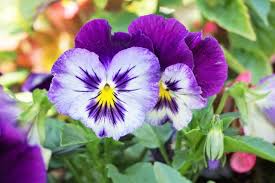
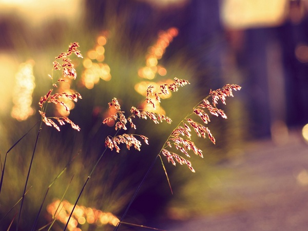
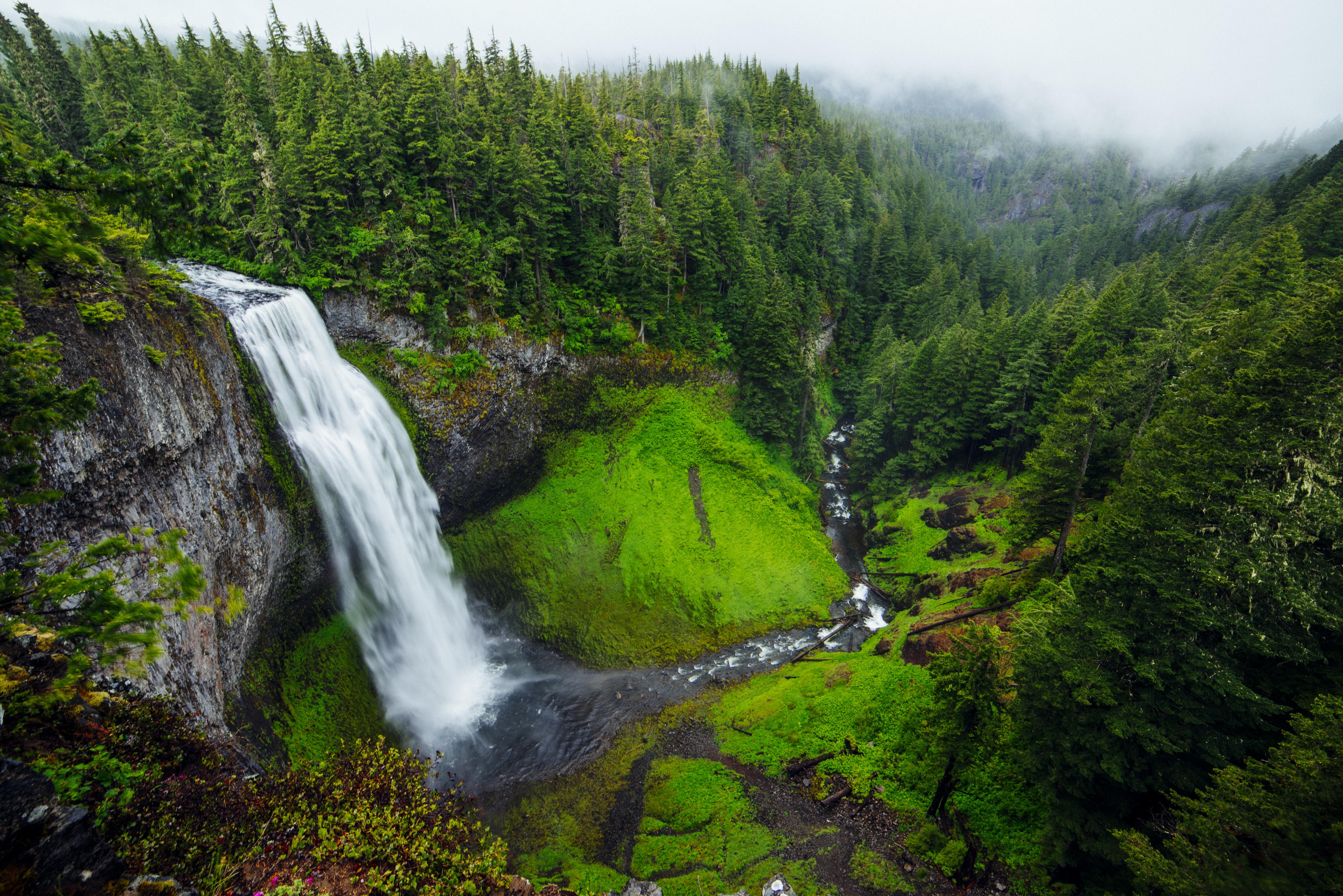
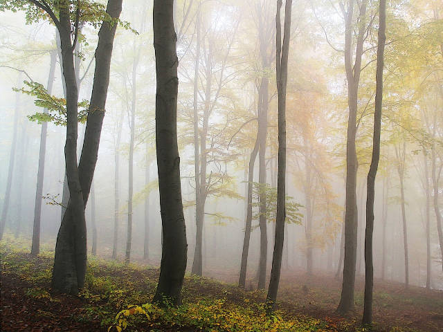
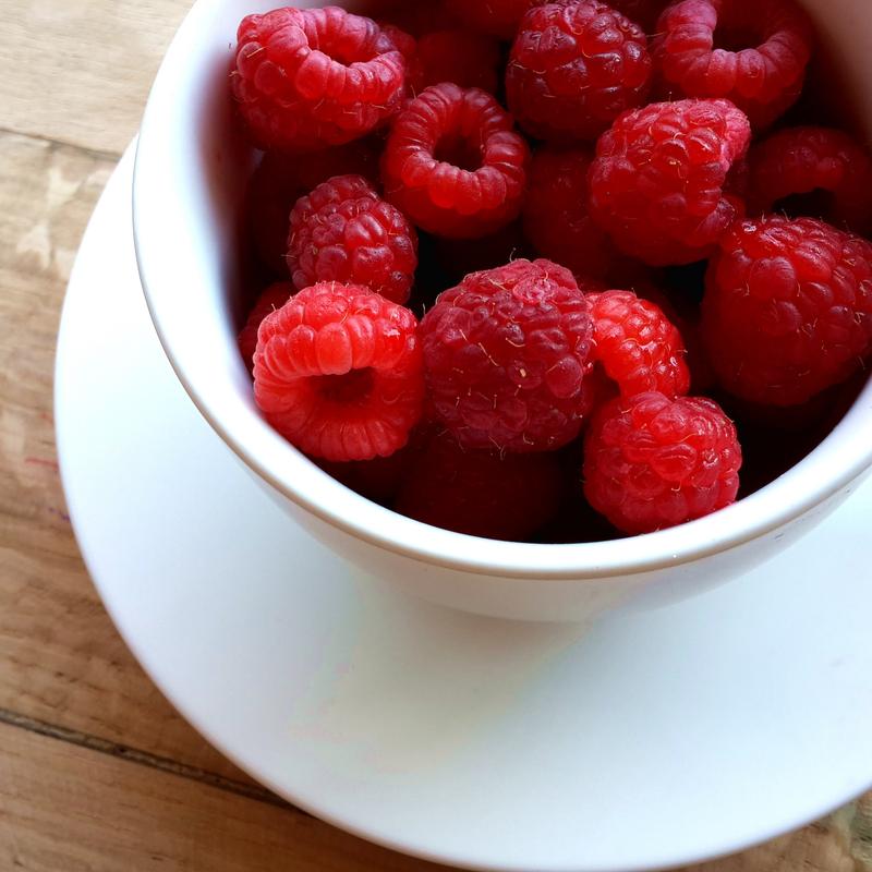
Using a new CSS property called shape-outside, we can easily wrap text to match the shape of the image. We are no longer limited to the box model defining the shape around the image to be wrapped. As you can see the text wraps around the circle flowing around it using a shape similar to the image. This can be accomplished by using the new CSS property shape-outside.
Using a new CSS property called shape-outside, we can easily wrap text to match the shape of the image. We are no longer limited to the box model defining the shape around the image to be wrapped. As you can see the text wraps around the circle flowing around it using a shape similar to the image. This can be accomplished by using the new CSS property shape-outside.
Using a new CSS property called shape-outside, we can easily wrap text to match the shape of the image. We are no longer limited to the box model defining the shape around the image to be wrapped. As you can see the text wraps around the circle flowing around it using a shape similar to the image. This can be accomplished by using the new CSS property shape-outside.

example
sample2